Design Principles - Task 1
03/02/2025 - 17/02/2025 / Week 1 - Week 3
Ye YingYing / 0364398Design Principles / Bachelor of Design (Hons) in Creative Media / Taylor's University
Task 1 - Exploration (20%)

1. Final Compilation
2. Instruction
3. Progress
4. Feedback
5. Reflection
2. Instruction
3. Progress
4. Feedback
5. Reflection
INSTRUCTION
- Explore and descripe the following design principles: Gestalt theory, Contrast, Emphasis, Balance, Repetition, Movement, Harmony & Unity, Symbol, and Word & Image.
- Select a design work that interests you, upload it with details information of the artwork.
- Write a 150-200 word explanation on why you chose the artwork and what makes it special.
- Llist and briefly describe the design principles you observed in the artwork.
- Include feedbacks from the lecturer in blog post.
PROGRESS
Exercise - Understanding Design Principles Gestalt Theory
- Gestalt Theory explains how the human brain perceives visual elements as unified wholes rather than separate parts. It simplifies complex scenes into recognizable patterns and structures.
- Similarity: Similar elements are grouped together as a whole.
- Continuation: The eye follows paths, lines, and curves for a smooth visual flow.
- Closure: The brain fills in missing parts to perceive a complete shape.
- Proximity: Elements placed close together are seen as related.
- Figure/Ground: Objects are seen as either the main subject (figure) or background (ground).
- Symmetry & Order: Symmetrical elements are perceived as a unified group.
 |
| 《Vertumnus》by Giuseppe Arcimboldo |
- This artwork mainly shows the concept of Closure to create a unified image. Various fruits, vegetables, and plants are arranged to resemble a human face. Even though these elements do not inherently form facial features, viewers still can recognize all the facial features, mentally completing the missing details.
- The artist effectively applies this concept of Proximity. The fruits, vegetables, and flowers are distinct objects, their arrangement guides viewers to group them into a recognizable human face.
Contrast
- Contrast is the use of strongly different elements to create visual interest. It prevents monotony, highlights key points, and enhances expression.
 |
| 《Moodswings in to Order》by DPR IAN - Album Cover |
- The vivid red background creates a strong contrast against the dark clothing of the subject.
Emphasis
- Emphasis creates focus and dominance in a design using elements like color, shape, and value to draw attention.
 |
| Flower by Ye Ying Ying |
- The flower’s soft pink color contrasts sharply with the deep green leaves, making it stand out.
- This difference in light intensity makes the flower pop and ensures it remains the focal point.
- This placement of the flower naturally guides the viewer’s eye to the emphasis itself.
Balance
- Balance distributes visual weight to create stability. **Symmetrical balance** arranges elements evenly, while **asymmetrical balance** uses unequal elements for dynamic effects. The **Golden Ratio** (1.618) and **Rule of Thirds** help designers achieve harmony and visual appeal.
.jpg) |
| Important Pair Of Doors by Edgar Brandt, Circa 1925 |
- The two-panel design creates a sense of perfect symmetry, where each side mirrors each other.
Repetition
- Repetition creates rhythm and pattern, making a design feel active. Adding variety prevents monotony and enhances visual interest.
 |
| Chairs by Ye Ying Ying |
- The stacked chairs create a sense of repetition as their identical shapes and structures are consistently repeated.
- The gaps between the stacks add another layer of repeated patterns.
- The neutral tones of the chairs enhance the repetitive effect
Movement
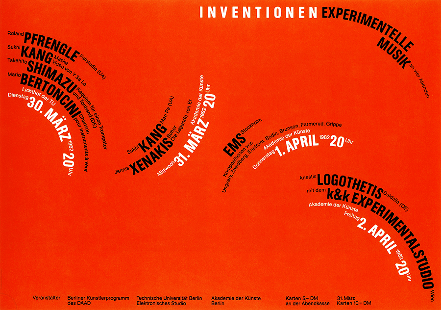
- Movement guides the viewer’s eye through a composition, creating a sense of motion. It is achieved using shapes, lines, curves, and forms that suggest dynamic flow.
 |
| INOVENTIONEN by Bernard Stein, 1982 |
- The text follows a wave-like curved path, naturally guiding the viewer’s eyes across the composition from left to right and top to bottom.
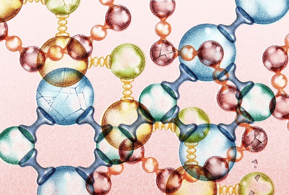
Harmony & Unity
- Harmony ensures elements complement each other, while unity ties them together through repetition, creating balance and cohesion.
 |
| Extracellular matrix by Anna Victoria Molofsky |
- The molecular shapes are repeated throughout the composition, creating visual consistency and a sense of wholeness. All elements work together in a unified system.
- The soft pastel tones blend smoothly, with no harsh contrasts.
- The elements appear interconnected, with smooth, organic transitions between them. The soft edges enhance the feeling of harmony.
Symbol
- Pictorial Symbols – Simplified images related to real objects.
- Abstract Symbols – Resemble objects but with fewer details.
- Arbitrary Symbols – Have no visual connection to their meaning; their significance is learned.
 |
| Yin-Yang Symbol |
- The Yin-Yang symbol is a minimalist, abstract design made of a circle divided into two in opposite colors.
- The symbol has a unique and memorable shape, showing the concept of balance, duality, and harmony.
Word & Image
- Imagery is crucial in design, helping users connect with a concept or brand. Pairing the right words with images enhances meaning, while typography and strategic text placement create visual hierarchy and balance.
 |
| Saito Makoto introductory poster by Doga er |
- Letters appear to be part of the face’s expression and blend into the composition, interacting with the image elements.
- Some words are fragmented or scattered, guiding the viewer to engage with the text visually before reading it.
- The placement of letters creates a sense of rhythm and flow, guiding the eye across the composition.
Artwork title: "Ba-Tsu poster"
Artist name: Makoto Saito
Date created: 1994
Medium: offset lithograph
Dimensions: 40 9/16 in. × 57 5/16 in. (103 cm × 145.6 cm)
- Why I Love This Artwork -
I love this artwork because it creatively blends words and images, not just presenting text and a face separately, but making them feel like a single, unified expression as if they are part of their thoughts, voice, or identity. This integration makes me feel that words are not just something we say or write, they are part of who we are. The connection between the text and the person makes the piece feel deeply expressive, almost as if the words are alive.
I love this artwork because it creatively blends words and images, not just presenting text and a face separately, but making them feel like a single, unified expression as if they are part of their thoughts, voice, or identity. This integration makes me feel that words are not just something we say or write, they are part of who we are. The connection between the text and the person makes the piece feel deeply expressive, almost as if the words are alive.
The dynamic letters make the texts full of energy. They seem to come out of the person's mouth, as if the words are being spoken, whispered, or even escaping from the person which makes the text feel like part of the person's expression. This creates a deep emotional connection, making the artwork feel personal and immersive.
209 words
- Visual Observation -
This artwork features a portrait with typographic elements seamlessly blended into the composition, making the text feel like an extension of the subject’s part rather than a separate element. The random arrangement of the floating, rotating, and stacking letters creates a sense of movement and energy, and it also blurs the part between words and images, making the artwork feel more connected and cohesive, which creates a sense of harmony & unity.The contrast between the dark text and the lighter face enhances the visual impact, making the words stand out while also adding depth. The different sizes and placements of the letters create an illusion of three-dimensional space, making the composition more dynamic. The repetition of letters forms a pattern-like effect, showing the artwork’s cohesion and rhythm. This makes the artwork more interesting to explore, as the viewer's attention shifts between the face and the text.
FEEDBACK
- WEEK 1 -
In the first class, Dr. Jinchi introduced the module structure, briefed us on our first task, and clarified the expectations, assessment methods, and documentation process. We will have weekly consultations with our assigned tutor, and attendance will be marked during these sessions.
In the first class, Dr. Jinchi introduced the module structure, briefed us on our first task, and clarified the expectations, assessment methods, and documentation process. We will have weekly consultations with our assigned tutor, and attendance will be marked during these sessions.
For the consultation this week, Mr. Fauzi reminded me to make sure that everything in the blog needs to be in the correct order and to start the following part as soon as possible.
- WEEK 3 -
Mr. Fauzi had started with Task 2 already.
REFLECTIONS

Comments
Post a Comment